Get stunning travel pictures from the world's most exciting travel destinations in 8K quality without ever traveling! (Get started for free)

7 Creative Ways to Merge Travel Photos for Stunning Social Media Collages
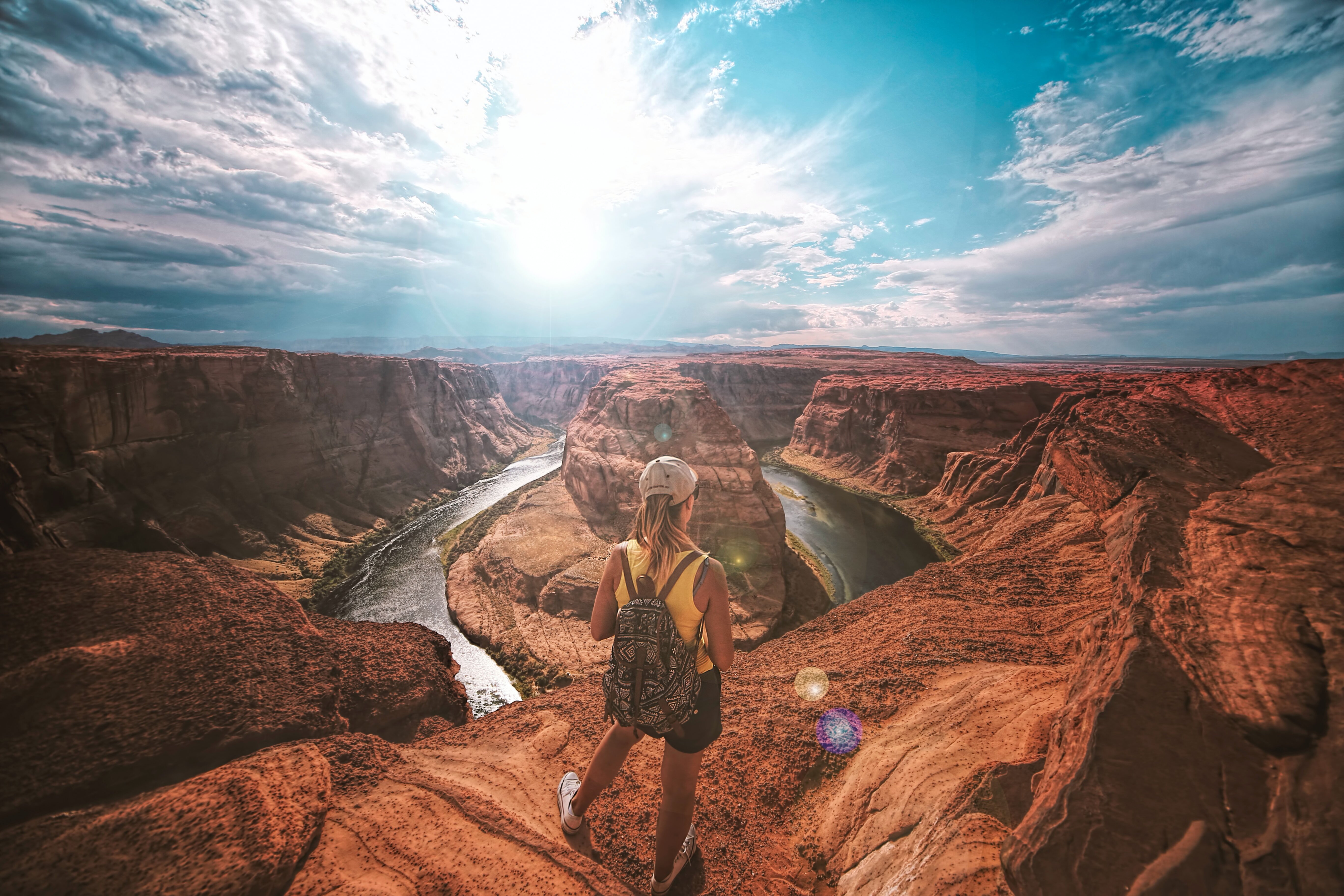
7 Creative Ways to Merge Travel Photos for Stunning Social Media Collages - Blending Panoramic Landscapes with Close-up Details

Combining expansive landscape shots with detailed close-ups offers a powerful way to showcase the heart of a travel destination. This approach lets you weave a more comprehensive narrative, highlighting both the sweeping grandeur of a scene and the smaller, captivating elements within it. Perhaps it's the intricate patterns on a centuries-old building or the burst of color from a local flower. Achieving a seamless blend often relies on thoughtful image overlap and careful camera positioning, ensuring a smooth flow from the vast surroundings to the specific details. Thankfully, numerous photo editing tools and techniques can assist in perfecting this merging process, helping you create compelling images. This technique, when done well, creates visually rich content that resonates on social media and prompts viewers to appreciate the interconnectedness of the big picture and the small wonders found while traveling. While this method certainly has potential, it's worth noting that the editing process can be somewhat involved, especially if aiming for flawless transitions.

When merging expansive landscapes with intricate close-ups, the challenge of capturing a wide field of view becomes apparent. Standard camera lenses often fall short of the human eye's natural field of vision, making panoramic photography a bit more involved. It's a technical matter, requiring some overlap when taking a series of shots—around 30-40% seems to be a useful guideline for effective stitching in software. Interestingly, when shooting vertically using drones, rotating the camera 45 degrees between each capture often leads to smoother results.

The file format in which photos are captured matters. Using RAW for drone panoramic shots has shown to provide superior image quality for the blending process. While some software provides automated stitching capabilities, it's not always perfect. In some instances, manual adjustments in programs like Adobe Lightroom or Photoshop's Photomerge are necessary. It's also worth noting that third-party options like Photo Joiner exist for those who prefer online tools to assemble and modify their photos.

A stable platform, like a tripod, is crucial for panoramic photography as it ensures the alignment of images during capture and reduces the chance of blurring or misalignment. Even with advancements like Adobe Bridge's Camera Raw capabilities for merging photos into a DNG file, meticulous attention to detail in the initial shooting phase ensures that these powerful tools can work effectively. Some of the most respected panoramic photographers focus on mastering composition and technique, showcasing the artistry and skill that can be infused into seemingly technical pursuits.

7 Creative Ways to Merge Travel Photos for Stunning Social Media Collages - Crafting a Visual Travel Timeline Through Layered Images

yellow Volkswagen van on road, (contact me for the full resoluton image)

Crafting a travel timeline using layered images offers a visually compelling way to showcase your adventures in a single photo. Imagine blending a bustling market scene from one city with a serene sunset from another, creating a rich narrative that encapsulates your journey. This approach not only presents your experiences but also triggers a sense of nostalgia and connects viewers to the places you've explored. While it may demand some editing finesse, the final result can create a standout social media post that prompts engagement and perhaps even travel inspiration. You can play around with overlaps and transparency levels to highlight the unique features of each location, effectively constructing a story that encourages discovery and a sense of wonder. While it has potential to be effective, it can be a bit of a challenge to ensure that all the various parts of the photos seamlessly merge in a visually appealing way.

Imagine constructing a visual narrative of your travels, not just with a series of photos, but by layering them to create a timeline. This approach, where images overlap and subtly reveal different aspects of your journey, offers a captivating way to showcase the evolution of a trip. It's like flipping through a photo album, but instead of static snapshots, you see glimpses of various moments intertwined.

The concept is rooted in how our brains perceive depth and sequential events. By strategically positioning images, we can build a sense of movement and progression, making viewers feel like they're experiencing the journey alongside us. For instance, layering a wide-angle shot of a bustling marketplace over a close-up of a colorful detail from a local vendor's stall can instantly convey both the atmosphere and the specific charm of that place.

However, there are technical considerations. Achieving a harmonious blend requires meticulous planning and, often, skilled post-processing. Ensuring that the images align and transition smoothly is crucial to avoiding jarring effects that disrupt the narrative. Interestingly, it seems that our visual systems are more forgiving when there's a sense of continuity in the subject matter—the viewer's eye can more easily 'fill in the gaps' where images subtly meld together.

In the world of digital photography, tools like Adobe Photoshop and Lightroom are commonly used to achieve this layered effect. But achieving seamless transitions can sometimes be a challenge, even with powerful tools. This method certainly requires some technical knowledge and experimentation to achieve the desired outcome. There's a learning curve involved in understanding how different blending modes impact the final appearance.

While some influencers use this technique to impressive effect, crafting visually rich and engaging travel timelines requires more than just throwing images on top of one another. It’s about developing a keen eye for composition, understanding how the interplay of colors and elements creates a story. It's akin to weaving a tapestry, where the thread of each picture contributes to the overall image. And just like any craft, the mastery of layered images requires practice and exploration to unlock its full potential.

7 Creative Ways to Merge Travel Photos for Stunning Social Media Collages - Using Geometric Shapes to Frame Diverse Destination Shots

Framing diverse travel destinations using geometric shapes can significantly enhance the visual appeal of your photos and elevate your social media collages. Techniques like the rule of thirds or the golden triangle composition can help guide the viewer's eye towards focal points, creating a sense of balance and visual harmony within the frame. Geometric shapes and patterns add another layer of depth and narrative, transforming basic travel photos into engaging stories that capture a viewer's attention. The choice of shapes matters too; squares often suggest order and structure, while circles can embody a feeling of unity or perfection. These techniques are particularly helpful for influencers documenting their travels, as using them can transform casual selfies into thoughtfully composed artistic expressions that resonate with their followers. Mastering this aspect of travel photography can elevate the influencer's ability to share their experiences in a way that's both visually attractive and emotionally engaging. While technically simple, the strategic use of geometric shapes requires some creative thinking and practice to achieve the desired impact.

Using geometric shapes to visually organize and frame travel photos can significantly enhance their impact, particularly in the context of social media. Our brains process visuals incredibly fast, and geometric framing acts as a visual shortcut, directing the viewer's attention to the key elements of the photo. Influencers who understand this can use it to their advantage, crafting content that grabs attention quickly.

There's a fascinating interplay between the shapes we use and the emotions they evoke. Circles, for instance, often communicate a sense of harmony, while angular shapes can suggest stability or strength. This psychological effect can be strategically deployed, allowing photographers to subtly influence how a viewer interprets their travel stories.

Moreover, established composition techniques, like the Rule of Thirds, align well with geometric framing. By positioning key elements at intersections or along lines created by shapes, photographers can craft visually appealing images that resonate with viewers on a fundamental level. There's a reason why symmetrical compositions often feel more aesthetically pleasing. Our brains, it seems, have an innate preference for patterns and balance—qualities that can be further accentuated using geometric elements.

It's intriguing how the very algorithms that drive social media platforms may favor images with clear geometric framing. While it's not always obvious, certain image attributes, including composition, can impact how a photo is ranked within feeds. This means, in a subtle but meaningful way, mastering geometric framing can be advantageous for getting more visibility for your travel content.

Beyond simply improving composition, geometric shapes can also elevate storytelling in travel photography. A square frame might lend a sense of tradition, while a spiraling one could communicate a sense of dynamic motion—perfect for conveying a sense of adventure. This isn't just about aesthetics but also about layering in meaning, adding depth to the travel narrative.

Interestingly, there's a connection between the science of color and geometric shapes. Framing warm colors within a triangle, for example, can seem to amplify their intensity and impact. This suggests that the choice of frame can interact with color in a subtle yet potent way, impacting how a viewer experiences the overall photo. It's a relatively new area of research, but the potential implications for visual communication on platforms like Instagram or TikTok are significant.

Finally, minimalism, a prominent trend in contemporary photography, dovetails neatly with the idea of geometric framing. By removing unnecessary clutter and simplifying the composition, minimalist photos often achieve a clear, crisp aesthetic that many influencers find appealing for their target audiences.

Overall, the thoughtful application of geometric shapes is a tool that any travel photographer, especially those who leverage social media, can use to their advantage. It's a way of harnessing basic visual principles to create more engaging and memorable content—a strategy that can help differentiate your images and stories in the increasingly crowded space of online travel content.

7 Creative Ways to Merge Travel Photos for Stunning Social Media Collages - Incorporating Local Typography and Signage into Photo Mosaics

Integrating local text and signage into photo mosaics can significantly enhance travel photos, adding a layer of cultural context and a more personalized feel to your storytelling. This technique goes beyond standard landscape shots or influencer selfies by incorporating genuine elements that reveal the unique character of a place. Carefully selecting signs or lettering that represent the heart of a location helps you craft a mosaic that resonates with viewers, evoking a sense of belonging and identity. However, successfully combining these elements demands a discerning eye for composition and skillful editing. It's important to make sure the typography complements the image rather than dominating it. In today's social media landscape, where originality is valued, this approach offers a fresh opportunity for travel photographers to make their work stand out in a sea of similar content.

Local typography and signage can act as a cultural window for travelers, offering a glimpse into the unique identity and history of a place. Designers often weave regional scripts and lettering styles into their work, creating a visual language that reflects the local community. By incorporating these elements into travel photos—and further, into photo mosaics—we might gain a richer understanding of the destination we're exploring.

Some research indicates that photos featuring local typography and signage can lead to increased engagement on social media. It seems that people are drawn to the authenticity of these localized elements, a sense of "this is real and unique to this place." Our brains are wired to recognize and interpret text within images, so even if we don't understand the specific language, these visual cues can help us connect with the image and the place it represents.

This connection goes beyond mere visual interest; it taps into emotional engagement. People are more inclined to share photos that resonate with them culturally and personally, which is a significant consideration for influencers looking to build and maintain a following. The interplay of familiar and unfamiliar, such as whimsical fonts placed against a more traditional backdrop, creates a fascinating visual tension that prompts viewers to pause and reflect.

Interestingly, this visual interplay can enhance our memories. Research suggests that familiar language patterns can help us retain information more effectively. So, integrating local signage into collages or mosaics might help viewers recall their travel experiences more vividly. Influencers who incorporate this approach could inadvertently tap into a sense of nostalgia for their followers, particularly if the signage triggers a personal memory or association.

The choice of font and color can also influence viewers' emotional responses. Typography is not just about legibility, but also about conveying a mood or feeling. Photographers can strategically employ certain fonts and colors to invoke joy, curiosity, or a range of other emotions. When woven into a well-composed photo collage, local typography can help guide the viewer's eye, emphasizing particular details and enhancing the narrative power of the image.

Furthermore, integrating local signage into photo mosaics can spark a sense of participation among viewers. People often share their own interpretations and experiences related to a particular place, which fosters a sense of community among those who've traveled or are interested in travel. It's a fascinating blend of visual design and social engagement, adding another layer to how we interact with travel photography in the digital age. While this area of study is still developing, the potential for creating more engaging and meaningful travel experiences is quite promising.

7 Creative Ways to Merge Travel Photos for Stunning Social Media Collages - Merging Day and Night Scenes for Dynamic City Portraits

Combining day and night photos of cities creates dynamic and engaging visuals that capture the essence of a place across time. It showcases the shift from bustling daytime activity to the alluring ambiance of the city at night, painting a fuller picture of the urban landscape. Merging these different times of day highlights the contrasting colors and moods, elevating travel photos to more captivating stories. Techniques like long exposures can be used to capture the unique light trails created by traffic, enhancing the sense of motion and activity. However, maintaining camera stability is crucial for preventing blurriness due to slower shutter speeds required for these shots. This technique can be particularly beneficial for social media influencers, enabling them to craft content that invites viewers to immerse themselves in the lively and multifaceted experiences of their travels through a single image. While it might seem like a simple process at first glance, this merging approach requires consideration and technical skill for a cohesive and engaging result.

Combining day and night scenes in city photography presents a unique challenge and opportunity. Our visual systems are particularly drawn to the contrast between bright daylight and the warmer hues of artificial city lights at night. It's a fascinating interplay of light and color, which can lead to more impactful photographs.

Daylight typically has a color temperature around 5500K, while artificial lights at night vary, often between 2700K and 4000K. Knowing this difference and using techniques to balance them during capture or editing can significantly enhance the overall appeal of a photo. Techniques like High Dynamic Range (HDR) photography come in handy here, enabling the capture of a broader spectrum of light and shadow details. This, in turn, translates to a more realistic and nuanced merged image, which could be a big difference for someone trying to get better social media engagement.

Interestingly, the combination of day and night also creates a sort of visual narrative that can evoke strong emotions. Seeing both periods within one image, often suggests a journey or transition, which can make the viewer feel more connected to the content. While this might seem a simple observation, it's a powerful aspect when aiming to create engaging visuals for social media.

Of course, this type of image manipulation is heavily reliant on editing tools like Adobe Photoshop or Lightroom. These programs utilize clever algorithms to blend colors and light smoothly. Achieving a seamless transition between vastly different lighting conditions can be tricky, but these tools can definitely help to bridge that gap and make a technically complex process easier.

It's worth noting that influencer culture has really embraced this day and night merging technique. It's becoming increasingly common to see it in travel and city-focused posts. Not only does it add a visually striking element, but it also helps the influencers craft a more distinct identity through their photography, making their content stand out.

Furthermore, the perception of a merged day and night image can change quite a bit depending on the culture being shown. Some cultures place higher importance on nighttime activities than others, which could impact how viewers react to the photograph. And, this difference can create some interesting discussions in the comments sections, adding yet another layer to how the imagery is received.

It also appears that our brains are more inclined to linger over photos that are a bit more visually complex. There's something about the contrasting nature of merging day and night that captures attention. Studies have shown that viewers spend more time looking at images that are more stimulating, and as a result, these images are more often shared and interacted with online.

Interestingly, a combined day and night scene also subtly reminds us of time-lapse photography. This association can pique interest and draw attention to the photo as something innovative. People are naturally curious about how things change over time, so the suggestion of change inherent in these images is an intriguing element.

Lastly, mastering blending techniques is crucial for a seamless final image. The proper use of layer masks and feathering edges are key to achieving a smooth transition. Small adjustments to the contrast and brightness can refine the image even further, helping you to create a far more compelling piece of artwork.

In conclusion, merging day and night scenes in city photography offers a dynamic approach that can captivate the viewer, evoke emotion, and enhance visual engagement. While it involves careful planning and manipulation in post-processing, the result can be a truly memorable and eye-catching photo that truly stands out in the increasingly crowded space of travel photography on social media.

7 Creative Ways to Merge Travel Photos for Stunning Social Media Collages - Combining Aerial Views with Street-Level Perspectives

By blending aerial shots with street-level perspectives, travelers can offer a more comprehensive view of a place, making their social media stories more captivating. Think of pairing a sweeping drone shot of a city with a close-up photo capturing the hustle and bustle of a local market. This contrast between the grand scale of the city and the intricacies of daily life creates a deeper connection for viewers. It allows them to experience not only the overall layout but also the nuanced details that often make a destination unique. Using this technique helps travel photos stand out because it shows both the vastness of a scene and the charming details within it. It's a particularly useful tactic for social media influencers wanting to stand out from the crowd, crafting visually striking collages that resonate with their audience on platforms like Instagram. Although this blending of different perspectives can be visually appealing, the success of this approach depends on how well the aerial and street-level shots are chosen and combined, a process that can take some practice and experimentation.

Combining aerial views with street-level perspectives in travel photography can create visually compelling and informative social media collages. This merging of viewpoints offers a unique way to showcase a location, highlighting both the broad landscape and the intimate details found on the ground.

One interesting facet is the way it affects our perception of depth and scale. Aerial photos, taken from above, provide a unique bird's eye view that can distort our understanding of how far away things are. When these shots are paired with images taken from street level, it can help viewers develop a richer, more nuanced understanding of the environment. Essentially, the two perspectives work together to bridge the gap between the grand view and the specifics of a particular area.

Another interesting point is the influence on how we process information. It turns out that our minds can handle complex ideas more easily when presented with varied visual angles. Blending aerial shots with street-level shots makes it easier for the viewer to see the interconnectedness of a scene. You can see the whole area and the little things that make it unique at the same time, resulting in a more efficient and immersive understanding.

The color palettes in aerial and street-level photos are quite different, too. Aerial shots often capture a wider range of colors, while ground-level photos typically have more concentrated, vivid hues. This difference allows photographers to play with color psychology—using it to evoke particular emotions in their viewers. When they're skillfully combined, the two perspectives generate a more profound impact on viewers, and it's not just about color either. The way our eyes scan the combined images, there's a natural movement from the wider aerial view down to the street-level details, creating a sort of built-in visual story within the image itself.

Interestingly, the human brain favors patterns and familiar surroundings—that innate preference for recognizable things contributes to the effectiveness of combining aerial and street level photos. By placing the larger aerial views alongside close-up shots of local details, a travel photographer can build an appealing sense of comfort and familiarity while still revealing new, exciting things about a particular location. This can contribute to greater audience engagement and sharing on social media platforms.

There's also a hidden narrative within these merged images that we don't always realize. Aerial shots often capture a sense of a specific time, like sunrise or sunset, while street-level shots are more about the moment-to-moment activity below. Combining those elements can subtly convey the dynamics of a location throughout the day. It's a way to show how a place changes and lives, enhancing the story it tells.

It seems that influencers who've mastered the technique of combining aerial and street-level perspectives in their travel photography have a significant advantage in keeping people engaged. There's evidence that using diverse visual angles in travel photography has a strong effect on people’s interest in the content, leading to more followers and greater reach.

In conclusion, there's a surprising amount of depth to how we visually experience travel photographs that blend aerial and street-level scenes. By carefully planning and combining these perspectives, photographers can create a more engaging, informative, and emotional impact. It seems that the result is a photograph that is more than just a collection of different pictures—it becomes a crafted visual experience that's rich with detail and compelling for social media platforms.

7 Creative Ways to Merge Travel Photos for Stunning Social Media Collages - Integrating Travel Selfies with Iconic Landmarks for Personal Touch

Integrating your travel selfies with iconic landmarks provides a unique way to personalize your travel photography and elevate your storytelling. Finding the best angles and utilizing tools like a tripod can significantly improve the quality of your selfies, allowing for better framing and composition. Experimenting with diverse poses and exploring different perspectives can create visually compelling narratives that capture not only the landmark itself but also your personal connection to it. Influencers, in particular, can use this approach to add depth and emotion to their travel content. When you connect your selfies with personal anecdotes and memories related to the location, you forge a stronger connection with your audience. Instead of just sharing a picture, you're providing a glimpse into your unique experience. This personal approach creates more relatable and memorable content, making your social media posts more impactful and encouraging deeper viewer engagement. It's about inviting your audience to experience your journey alongside you, creating a more powerful and authentic narrative within the context of iconic destinations.

Integrating a selfie with an iconic landmark can be a powerful way to personalize a travel photo and make it more engaging. It's a simple idea, yet it taps into some interesting psychological aspects. Research suggests that including a person, specifically a selfie, in an image of a recognized landmark can create a stronger emotional connection for the viewer. They see a familiar landmark, but it's also infused with a personal element, a relatable human experience. This often evokes a sense of nostalgia or even prompts a viewer to imagine themselves at that location, which can be a crucial factor in audience engagement.

While the idea of integrating a selfie with a backdrop is straightforward, the execution can be tricky. The visual impact depends heavily on getting the right angle, lighting, and post-processing. It's also about balancing the elements. You want to showcase the landmark, but the selfie shouldn't be lost in the scenery either. Finding that sweet spot can take some trial and error. For instance, it's beneficial to consider the natural light—the 'golden hour' lighting provides a softer and generally more flattering light that can improve the quality of both the person and the scene in the image.

The editing process can also have a big impact. Tools that allow for layering and blending are useful in making the selfie seem seamlessly integrated within the scene. However, you have to be careful not to over-edit. It's best to keep the editing subtle and preserve the integrity of both the individual and the landmark. Excessive editing can often result in an image that appears unnatural or contrived.

Social media has also played a significant role in how selfies and landmarks are combined. Algorithms used by social media platforms appear to favour content that includes people, possibly because it’s more likely to trigger engagement. This creates a subtle but potentially significant advantage for posts that use this technique, possibly resulting in greater visibility for travel-related content. This could be a worthwhile aspect to consider when developing content for a travel blog or social media profile.

Furthermore, when it comes to the actual composition of the photo, the rule of thirds often yields good results. It helps with leading the viewer's eye through the image and helps create a more dynamic composition. Placing the selfie slightly off-center can help direct the viewer's attention to both the person and the surrounding environment. It also adds a more artistic feel and makes the image visually more appealing.

Finally, selfies integrated with landmarks, when done well, can aid in memory encoding. Because the image captures both a personal experience and a recognisable element, it's more likely to be retained in memory. It's as if the brain stores the information twice—through the visual element and through personal association. This could lead to better memory recall of travel experiences, which is a very interesting facet of human cognition and visual information processing.

While there's still much to be researched and learned, the practice of merging selfies and landmarks within travel photos reveals some fascinating details about how we experience images and the psychological effects they can have. As tools like smartphones continue to advance, and visual content remains so popular in social media, we can expect to see more creative explorations and research into this intriguing practice in the coming years.


Get stunning travel pictures from the world's most exciting travel destinations in 8K quality without ever traveling! (Get started for free)


More Posts from itraveledthere.io: